
Deluxe Graphing

| Developer: | Glenn's Plugins Like this plugin? Show your appreciation! |
| Category: | A/V and IR Equipment |
| Github: | Github Repo |
| Assistance: | Get help! |
| Plugin ID: | com.GlennNZ.indigoplugin.deluxeGraphing |
| Latest release: | v1.1.37 released on Sept. 5, 2026 |
| Release downloaded: | 11 times |
| Requires: | Indigo v2023.2.0 or higher |
| (Check the Releases tab below for older releases that may have different requirements) | |
| Download latest release |
Deluxe Graphing (Indigo Plugin)
Deluxe Graphing is an Indigo plugin that provides a simple local web app for viewing historical Indigo device state data as charts (from a PostgreSQL-backed history table). It can also generate PNGs on demand, making it ideal for wall/tablet dashboards and Indigo Control Pages.
It’s designed to work well with dashboard apps such as Kiosk Home:
- Use the Web URL for a live/refreshing view (ideal for an iFrame / “Go to External URL”)
- Use the Render PNG URL when you want an image file updated on demand (ideal for Indigo Control Pages and image-based dashboards)
Screenshots
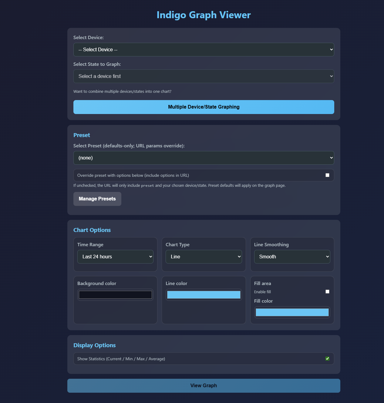
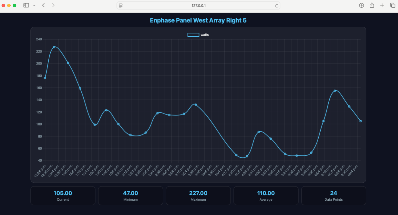
Single graph (one device + one state)
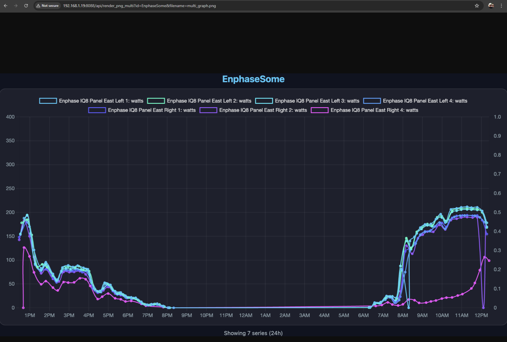
Multi graph (multiple devices/states on one chart)
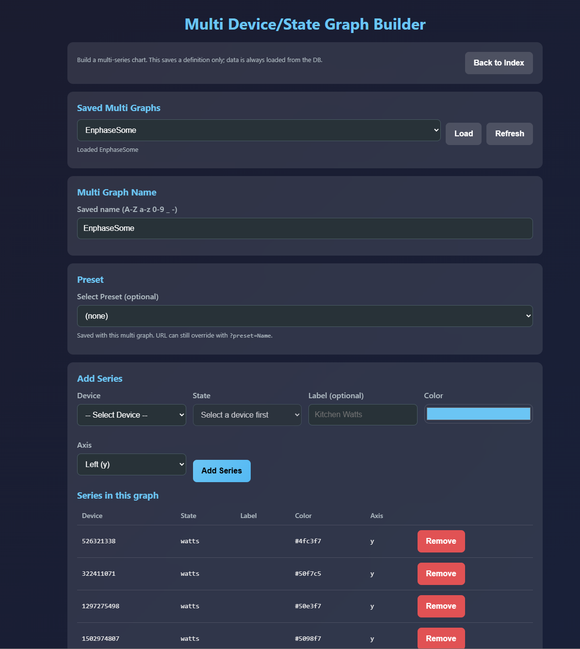
Multi graphs let you combine several device states into a single chart (for example, multiple “watts” states on the same chart, or a left/right axis pairing such as temperature + power).
Indigo Control Page example (PNG refresh)
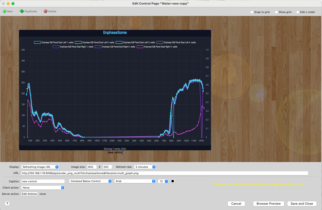
This shows how to use the Render PNG URL inside the Indigo Control Page editor so the image can be refreshed on a schedule (or by an Indigo action/trigger).
Features
Live web graphs
- Local web UI for selecting a device/state and chart options
- Shareable Web URL (bookmarkable)
- Auto-refreshing graph view for dashboards
- Charts fill the browser window and resize with it (ideal for kiosks/iFrames); set an explicit
aspectRatioin a preset'schartJsOverridesto get a fixed-shape chart instead
Presets (optional)
Presets provide defaults only (colors, chart options, etc.). Your URL options always win, so existing links won’t break.
Multi Device/State graphs (optional)
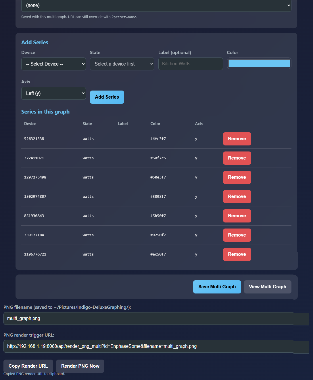
Create a saved “multi graph” definition that combines multiple device states into a single chart: - each series can have its own label and color - series can be assigned to different axes (for example left/right)
The builder page (shown in MainMulti.png) makes it easy to add multiple series and save them as a named multi graph. The multi graph viewer then displays them together (see Example_multi.png).
PNG rendering (for image-based dashboards)
Deluxe Graphing can render charts to PNG files and also return the PNG image directly.
This is especially useful when: - your dashboard prefers images rather than embedded web pages - you want to use Indigo Control Pages (see Controlpage.png) - you want a single image file updated on demand (for example, via a schedule)
For multi graphs, the builder page shows a ready-to-copy render URL at the bottom once you have saved a multi graph (see MainMultiPng.png).
Requirements
- Indigo 2025.x (plugin runs inside Indigo’s Python runtime)
- PostgreSQL configured with the expected history tables (configured in plugin preferences)
For PNG rendering only - Playwright + Chromium browser download (one-time)
Getting Started
- Install and enable the plugin in Indigo.
- Configure your database settings in plugin preferences.
- Start the plugin (the web server starts automatically).
Your Indigo log will show the local address to open in a browser.
How to use
1) Single graph
- Open the main web UI (shown in MainScreen.png).
- Select a device and the state you want to graph.
- Copy the Shareable Web URL for dashboards, or the Render PNG URL for image-based use.
- Open the URL in your dashboard app (Kiosk Home, browser shortcut, etc.).
The resulting chart looks like Example.png.
2) Multi Device/State graph
- From the main UI, click Multiple Device/State Graphing.
- In the multi graph builder (shown in MainMulti.png), add multiple device+state series.
- Optionally choose a preset, then Save the multi graph.
- Click View Multi Graph to open it (example shown in Example_multi.png).
- If you want PNG output, copy the render URL shown at the bottom (shown in MainMultiPng.png).
3) Indigo Control Page (PNG refresh approach)
If you’re building an Indigo Control Page and want the chart to appear as an image:
- Use the Render PNG URL as the image source (shown in Controlpage.png).
- Trigger refreshes on a schedule or via Indigo actions (the URL overwrites the saved PNG file and returns the image).
This gives you a reliable “always show latest chart image” workflow inside Indigo.
Presets (JSON)
Presets let you save a named set of defaults for how graphs look and behave. You manage presets using the built-in Preset Manager page (no manual file editing required).
A preset has three main sections:
uiDefaults“Simple” defaults that match the same options the UI normally puts into URLs (hours, chart type, colors, fill, stats, font).
chartJsOverrides(optional JSON object) Advanced Chart.jsoptionsoverrides. This is where you can change legend position, grid/tick styling, tooltip styling, animations, interaction mode, etc.
datasetOverrides(optional JSON object) Advanced per-series dataset settings (line width, points, dashed lines, stepped lines, etc.). For multi graphs, these overrides are applied to every series.
Most common overrides no longer require hand-written JSON — the Preset Manager has form controls that compile into the JSON for you:
- Legend: display on/off, position (top/bottom/left/right), label color
- Chart title: text and color (
plugins.title) - Y axis: min, max, axis label + label color, begin-at-zero
- Axis labels (ticks): font size, weight, and family for the x-axis time labels and y-axis value labels, plus per-axis colors (multi graphs apply the same styling to the right axis)
- Grid/tick colors, animation, aspect ratio, tooltips (as before)
- Line/point styling: line width, point radius, dashed line (compiled into
datasetOverrides) - Time format: 12-hour or 24-hour x-axis labels and tooltips (uiDefaults
timeFormat) - Point values: permanent value labels above the line (uiDefaults
values)
Permanent point-value labels
values=true (URL param, preset checkbox, or builder checkbox) draws each point's value above the line — like tooltips that never disappear. This uses the standard chartjs-plugin-datalabels plugin. Roughly every Nth point is labelled (about 12 per series) with automatic hiding of overlapping labels, the most recent point is always labelled, boolean states show ON/OFF, and in multi graphs each series' labels use that series' color.
Fine-tuning via chartJsOverrides uses the plugin's own well-documented options under plugins.datalabels, e.g.:
{
  "plugins": {
    "datalabels": {
      "font": { "size": 13 },
      "color": "#ffffff",
      "backgroundColor": "rgba(0,0,0,0.6)",
      "borderRadius": 4,
      "align": "top",
      "offset": 8
    }
  }
}
See the datalabels options reference for everything available (alignment, anchoring, backgrounds, padding, rotation, etc.). Labels only appear when values=true.
Common styling doesn't require JSON:
- Font size and decimal places:
valuesSize/valuesDecimalsURL params, preset uiDefaults fields, or the size field in the builders. - Everything else: the Preset Manager's Point value label styling card has form fields for font weight, font family, label color, background color, border radius, position (align), offset, and rotation — compiled into
plugins.datalabelsfor you.
Anything you type into the advanced JSON boxes still wins over the form-generated values on conflicts.
Notes: - URL parameters still override preset defaults (presets are “defaults”, not hard locks). - If you’re not seeing changes, add a “smoking gun” override like a chart title (example below) to confirm the preset is being applied.
Built-in presets
The plugin ships a starter library of presets, copied into your presets folder on startup — only if a preset with that name doesn't already exist, so your own presets and edits are never touched. Alongside the classic theme/legend/grid presets, these showcase the newer options:
- WallPanel_Transparent — chart-only overlay: no title/legend/stats, transparent background, 12-hour times, value labels in dark pills
- ControlPage_PNG — transparent fixed-shape (2.2) chart with no animation, tuned for crisp Control Page PNG renders
- Values_Minimal — clean gridless line with spaced value labels
- Energy_Watts — zero-based Y axis titled "Watts", filled line, whole-number value labels
- Temperature_12h — smooth filled line, 12-hour times, 1-decimal value labels
- BigText_Values — large axis/legend/tooltip fonts with bold 15px value labels (wall displays viewed from a distance)
- OnOff_Labels — stepped boolean chart with ON/OFF pill labels
- Classic_Fixed — restores the pre-1.1.36 fixed 2.2 aspect-ratio layout instead of fill-the-window
Using the Preset Manager

- Open the main Deluxe Graphing page.
- Click Manage Presets.
- Create a preset name.
- Set any
uiDefaultsusing the form. - (Optional) Paste JSON into:
- chartJsOverrides (advanced Chart.js options)
- datasetOverrides (advanced dataset styling)
- Click Save Preset.
Example JSON you can paste into the Preset Manager
You can paste this into chartJsOverrides:
{
  "aspectRatio": 3.2,
  "animation": {
    "duration": 1800,
    "easing": "easeInOutQuart"
  },
  "plugins": {
    "title": {
      "display": true,
      "text": "PRESET APPLIED",
      "color": "#ff00ff",
      "font": {
        "size": 18,
        "weight": "bold"
      },
      "padding": {
        "top": 6,
        "bottom": 10
      }
    },
    "legend": {
      "display": true,
      "position": "bottom",
      "labels": {
        "color": "#00ff00",
        "font": {
          "size": 16,
          "weight": "bold"
        }
      }
    },
    "tooltip": {
      "enabled": true,
      "animation": false,
      "backgroundColor": "rgba(0,0,0,0.95)",
      "titleColor": "#ff00ff",
      "bodyColor": "#00ff00",
      "borderColor": "#ff00ff",
      "borderWidth": 2
    }
  },
  "scales": {
    "x": {
      "grid": { "color": "rgba(255,0,255,0.25)" },
      "ticks": { "color": "#ff00ff" }
    },
    "y": {
      "grid": { "color": "rgba(0,255,0,0.18)" },
      "ticks": { "color": "#00ff00" }
    }
  }
}
And paste this into datasetOverrides:
{
  "borderWidth": 6,
  "pointRadius": 7,
  "pointHoverRadius": 10,
  "borderDash": [10, 6]
}
Quick reference: common keys
uiDefaults (simple / UI-aligned)
hours— default time window (e.g.24,48)type— chart type:line,bar,scattertension— line smoothing (0= angular,0.4= smooth)bg— page background color (hex, e.g.#0f1220)line— default accent/line color (hex)fill— fill under the line (true/false)fillColor— fill color (hex)stats— show/hide stat cards (true/false)values— draw point values above the line at spaced intervals, like permanent tooltips (true/false, defaultfalse)valuesSize— font size in px for the value labels (default11)valuesDecimals— decimal places for non-integer value labels (default1)title— show/hide the device title heading at the top of the page (true/false, defaulttrue)transparent— transparent page background and chart panel (true/false, defaultfalse)timeFormat— x-axis/tooltip time format:12(h:mm a) or24(HH:mm); empty = default 24-hourfont— CSS font-family string
chartJsOverrides (advanced Chart.js options)
These merge into the Chart.js options object.
plugins.legend.position— move legend:top,bottom,left,rightplugins.legend.labels.color— legend text colorplugins.legend.labels.font.size/weight— legend font stylingplugins.tooltip.*— tooltip colors, borders, enabled/disabledplugins.title.*— add a title (useful as a visual confirmation the preset is applied)scales.x.grid.color/scales.y.grid.color— grid line colorsscales.x.ticks.color/scales.y.ticks.color— tick label colorsanimation.duration/animation.easing— animation tuninginteraction.mode/interaction.intersect— how hovering/tooltip selection behaves
datasetOverrides (advanced per-series dataset options)
These merge into each dataset (series).
borderWidth— line thicknessborderDash— dashed line pattern, e.g.[10, 6]pointRadius— point size (0 hides points)pointHoverRadius— point size on hoverstepped— stepped-line behavior (true,"before","after") for on/off style states
Timezones (x-axis showing UTC?)
Graphs always display in the viewing browser's local time zone — there is nothing to configure on the display side.
What matters is how the plugin interprets the timestamps stored in your history database, which varies by setup: Indigo's SQL Logger writes UTC into sqlite (datetime('now')), but for PostgreSQL it uses now(), which follows the postgres server's timezone — local time on most Macs, UTC on some servers.
The plugin auto-detects this at startup (sqlite: inspects the ts column default; PostgreSQL: compares the server clock against UTC), logs the result, and then serializes every timestamp with an explicit UTC offset (e.g. 2026-09-05T14:23:01+10:00) so every browser converts it to its own local time correctly.
If your graph times are still shifted, override History timestamps are stored in (UTC / Server local time) in the plugin preferences — the Indigo log line History timestamp zone auto-detect: ... shows what was detected. This setting also keeps the "last N hours" query window aligned with how your data is stored.
Note on timezone overrides via
chartJsOverrides: JSON like"scales": { "x": { "adapters": { "date": { "zone": "America/Chicago" } } } }has no effect — that is achartjs-adapter-luxonfeature, and this plugin useschartjs-adapter-date-fns, which always renders in the browser's time zone. With the fix above you shouldn't need a zone override at all: each browser/wall panel shows its own local time.
For 12-hour vs 24-hour display, use the timeFormat option (URL param, preset uiDefault, or the Time Format selector in the builders) instead of hand-writing displayFormats JSON.
Hiding the title / legend and transparent backgrounds (chart-only view)
For wall panels and dashboard overlays you often want just the chart — no device title, no legend, and no page background. These three things live in different layers, so they are controlled in different places:
| What | Layer | How to control it |
|---|---|---|
Legend (e.g. sensorvalue) |
Chart.js | Preset Legend display checkbox, or chartJsOverrides → plugins.legend.display: false |
| Device title at the top | HTML <h1> |
title=false URL param, or preset Show device title checkbox |
| Page + chart panel background | CSS | transparent=true URL param, or preset Transparent background checkbox |
Via URL parameters
Both the single graph (/graph) and multi graph (/graph_multi) pages support:
title=false— hides the device/graph title headingtransparent=true— makes the page background, the chart panel background, and the panel border fully transparent
Example:
http://<indigo-server>:8088/graph?device=1828238559&state=sensorvalue&preset=MyPreset&title=false&transparent=true
Via a preset (no extra URL params needed)
In the Preset Manager, the uiDefaults section now has two checkboxes:
- Show device title (uncheck to hide the title)
- Transparent background (page + chart panel)
Combine those with unchecking Legend display in the Chart.js section, and a single preset gives you a completely clean, chart-only, transparent view:
http://<indigo-server>:8088/graph?device=1828238559&state=sensorvalue&preset=MyPreset
As always, URL params override the preset (title=true on the URL re-enables the title even if the preset hides it).
Transparent PNGs
transparent=true also works on the Render PNG URLs (/api/render_png and /api/render_png_multi). The renderer already screenshots with omit_background, so the resulting PNG has a genuinely transparent background — ideal for layering charts over Indigo Control Page backgrounds or dashboard images.
Show/hide checkboxes in the builders
- The single-graph builder's Display Options card now has Show Device Title and Transparent Background checkboxes, and includes them in the generated Web/PNG URLs.
- The multi-graph builder's Chart Options card has the same two options; they are only added to the URL when changed from their defaults, so a preset's own settings still apply otherwise.
Security / Token (optional)
If you set an access token in plugin preferences, the web UI will include it automatically in generated URLs.
| Released on: | Sept. 5, 2026 |
| Requires: | Indigo v2023.2.0+ |
| Downloaded: | 11 times |
| Download this release | |
DeluxeGraphing 1.1.37
A major usability release: correct timezones everywhere, charts that fill the browser, permanent point-value labels, form-based styling for nearly everything, and a new built-in preset library.
Timezone fixes
- Graph times are now correct in every browser. Timestamps are serialized with an explicit UTC offset, so the x-axis always displays in the viewing browser's local time zone. This fixes both the "x-axis shows UTC" symptom and the opposite double-shift (e.g. noon shown as 10pm).
- Auto-detection of database timestamp storage (new pref, default Auto-detect): SQL Logger writes UTC into sqlite but server-local time into PostgreSQL on most setups. The plugin now inspects the database at startup (sqlite:
tscolumn default; PostgreSQL: server clock vs UTC), logs what it found, and can be overridden to UTC / Server local time. - The "last N hours" query window now uses the same zone as the stored data — PostgreSQL graphs previously lost up to a timezone-offset's worth of history at the start of the window.
Layout
- Charts fill the browser window and resize with it — both single and multi graphs. Ideal for kiosks and iFrames; no more letterboxed strip in tall windows.
- Presets that set an explicit
aspectRatioinchartJsOverrideskeep a fixed-shape chart (see the new Classic_Fixed preset to restore the old look).
New display options (URL params + preset uiDefaults + builder controls)
title=false— hide the device title headingtransparent=true— fully transparent page + chart panel (also produces transparent PNGs)timeFormat=12|24— 12-hour or 24-hour axis labels and tooltipsvalues=true— permanent point-value labels above the line (powered by chartjs-plugin-datalabels): auto-spaced (~12 per series with overlap hiding), newest point always labelled, ON/OFF for booleans, per-series colors on multi graphsvaluesSize/valuesDecimals— label font size and decimal places
All of these pass through to the PNG render endpoints.
Preset Manager: style without writing JSON
New form sections that compile into the overrides JSON for you (your advanced JSON still wins on conflicts):
- Axis label styling — font size/weight/family and per-axis colors for the x-axis times and y-axis values (multi graphs extend this to the right axis)
- Point value label styling — font weight/family, color, background + border radius (pill labels), position, offset, rotation
- Chart basics — legend position, chart title text + color, Y-axis min/max/label/label-color/begin-at-zero
- Line/point styling — line width, point radius, dashed lines
- New uiDefaults: show title, transparent background, show values, value size/decimals, time format
New built-in presets
Seeded on startup, never overwriting existing presets:
- WallPanel_Transparent — chart-only overlay: no title/legend/stats, transparent, 12h times, pill value labels
- ControlPage_PNG — transparent fixed-shape chart with animation off, for crisp Control Page PNGs
- Values_Minimal — gridless clean line with value labels
- Energy_Watts — zero-based Y titled "Watts", whole-number labels
- Temperature_12h — 12-hour times, 1-decimal labels
- BigText_Values — large fonts throughout, for wall displays viewed at a distance
- OnOff_Labels — stepped boolean chart with ON/OFF pill labels
- Classic_Fixed — pre-1.1.36 fixed aspect-ratio layout
Upgrade notes
- After installing, check the Indigo log line
History timestamp zone auto-detect: .... If you previously saved plugin prefs with the timestamp zone set to UTC, switch it to Auto-detect in plugin config. - Presets/URLs need no changes; everything is backward compatible. If you had pasted
dgValueLabelsJSON from the short-lived 1.1.31 build, replace it with standardplugins.datalabelsoptions.
| v1.1.20 | Requires Indigo v2023.2.0+ | Released Dec. 21, 2025 | 1.1.20 Graphing of all Indigo Devices States, single or combined graphs. Live Updates. URL or PNG |
| Released on: | Dec. 21, 2025 |
| Requires: | Indigo v2023.2.0+ |
| Downloaded: | 55 times |
| Download this release | |
Deluxe Graphing (Indigo Plugin)
Deluxe Graphing is an Indigo plugin that provides a simple local web app for viewing historical Indigo device state data as charts (from a PostgreSQL-backed history table). It can also generate PNGs on demand, making it ideal for wall/tablet dashboards and Indigo Control Pages.
It’s designed to work well with dashboard apps such as Kiosk Home:
- Use the Web URL for a live/refreshing view (ideal for an iFrame / “Go to External URL”)
- Use the Render PNG URL when you want an image file updated on demand (ideal for Indigo Control Pages and image-based dashboards)
Screenshots
Single graph (one device + one state)
Multi graph (multiple devices/states on one chart)
Multi graphs let you combine several device states into a single chart (for example, multiple “watts” states on the same chart, or a left/right axis pairing such as temperature + power).
Indigo Control Page example (PNG refresh)
This shows how to use the Render PNG URL inside the Indigo Control Page editor so the image can be refreshed on a schedule (or by an Indigo action/trigger).
Features
Live web graphs
- Local web UI for selecting a device/state and chart options
- Shareable Web URL (bookmarkable)
- Auto-refreshing graph view for dashboards
Presets (optional)
Presets provide defaults only (colors, chart options, etc.). Your URL options always win, so existing links won’t break.
Multi Device/State graphs (optional)
Create a saved “multi graph” definition that combines multiple device states into a single chart: - each series can have its own label and color - series can be assigned to different axes (for example left/right)
The builder page (shown in MainMulti.png) makes it easy to add multiple series and save them as a named multi graph. The multi graph viewer then displays them together (see Example_multi.png).
PNG rendering (for image-based dashboards)
Deluxe Graphing can render charts to PNG files and also return the PNG image directly.
This is especially useful when: - your dashboard prefers images rather than embedded web pages - you want to use Indigo Control Pages (see Controlpage.png) - you want a single image file updated on demand (for example, via a schedule)
For multi graphs, the builder page shows a ready-to-copy render URL at the bottom once you have saved a multi graph (see MainMultiPng.png).
Requirements
- Indigo 2025.x (plugin runs inside Indigo’s Python runtime)
- PostgreSQL configured with the expected history tables (configured in plugin preferences)
For PNG rendering only - Playwright + Chromium browser download (one-time)
Getting Started
- Install and enable the plugin in Indigo.
- Configure your database settings in plugin preferences.
- Start the plugin (the web server starts automatically).
Your Indigo log will show the local address to open in a browser.
How to use
1) Single graph
- Open the main web UI (shown in MainScreen.png).
- Select a device and the state you want to graph.
- Copy the Shareable Web URL for dashboards, or the Render PNG URL for image-based use.
- Open the URL in your dashboard app (Kiosk Home, browser shortcut, etc.).
The resulting chart looks like Example.png.
2) Multi Device/State graph
- From the main UI, click Multiple Device/State Graphing.
- In the multi graph builder (shown in MainMulti.png), add multiple device+state series.
- Optionally choose a preset, then Save the multi graph.
- Click View Multi Graph to open it (example shown in Example_multi.png).
- If you want PNG output, copy the render URL shown at the bottom (shown in MainMultiPng.png).
3) Indigo Control Page (PNG refresh approach)
If you’re building an Indigo Control Page and want the chart to appear as an image:
- Use the Render PNG URL as the image source (shown in Controlpage.png).
- Trigger refreshes on a schedule or via Indigo actions (the URL overwrites the saved PNG file and returns the image).
This gives you a reliable “always show latest chart image” workflow inside Indigo.
Presets (JSON)
Presets let you save a named set of defaults for how graphs look and behave. You manage presets using the built-in Preset Manager page (no manual file editing required).
A preset has three main sections:
uiDefaults“Simple” defaults that match the same options the UI normally puts into URLs (hours, chart type, colors, fill, stats, font).
chartJsOverrides(optional JSON object) Advanced Chart.jsoptionsoverrides. This is where you can change legend position, grid/tick styling, tooltip styling, animations, interaction mode, etc.
datasetOverrides(optional JSON object) Advanced per-series dataset settings (line width, points, dashed lines, stepped lines, etc.). For multi graphs, these overrides are applied to every series.
Notes: - URL parameters still override preset defaults (presets are “defaults”, not hard locks). - If you’re not seeing changes, add a “smoking gun” override like a chart title (example below) to confirm the preset is being applied.
Using the Preset Manager
- Open the main Deluxe Graphing page.
- Click Manage Presets.
- Create a preset name.
- Set any
uiDefaultsusing the form. - (Optional) Paste JSON into:
- chartJsOverrides (advanced Chart.js options)
- datasetOverrides (advanced dataset styling)
- Click Save Preset.
Example JSON you can paste into the Preset Manager
You can paste this into chartJsOverrides:
{
  "aspectRatio": 3.2,
  "animation": {
    "duration": 1800,
    "easing": "easeInOutQuart"
  },
  "plugins": {
    "title": {
      "display": true,
      "text": "PRESET APPLIED",
      "color": "#ff00ff",
      "font": {
        "size": 18,
        "weight": "bold"
      },
      "padding": {
        "top": 6,
        "bottom": 10
      }
    },
    "legend": {
      "display": true,
      "position": "bottom",
      "labels": {
        "color": "#00ff00",
        "font": {
          "size": 16,
          "weight": "bold"
        }
      }
    },
    "tooltip": {
      "enabled": true,
      "animation": false,
      "backgroundColor": "rgba(0,0,0,0.95)",
      "titleColor": "#ff00ff",
      "bodyColor": "#00ff00",
      "borderColor": "#ff00ff",
      "borderWidth": 2
    }
  },
  "scales": {
    "x": {
      "grid": { "color": "rgba(255,0,255,0.25)" },
      "ticks": { "color": "#ff00ff" }
    },
    "y": {
      "grid": { "color": "rgba(0,255,0,0.18)" },
      "ticks": { "color": "#00ff00" }
    }
  }
}
And paste this into datasetOverrides:
{
  "borderWidth": 6,
  "pointRadius": 7,
  "pointHoverRadius": 10,
  "borderDash": [10, 6]
}
Quick reference: common keys
uiDefaults (simple / UI-aligned)
hours— default time window (e.g.24,48)type— chart type:line,bar,scattertension— line smoothing (0= angular,0.4= smooth)bg— page background color (hex, e.g.#0f1220)line— default accent/line color (hex)fill— fill under the line (true/false)fillColor— fill color (hex)stats— show/hide stat cards (true/false)font— CSS font-family string
chartJsOverrides (advanced Chart.js options)
These merge into the Chart.js options object.
plugins.legend.position— move legend:top,bottom,left,rightplugins.legend.labels.color— legend text colorplugins.legend.labels.font.size/weight— legend font stylingplugins.tooltip.*— tooltip colors, borders, enabled/disabledplugins.title.*— add a title (useful as a visual confirmation the preset is applied)scales.x.grid.color/scales.y.grid.color— grid line colorsscales.x.ticks.color/scales.y.ticks.color— tick label colorsanimation.duration/animation.easing— animation tuninginteraction.mode/interaction.intersect— how hovering/tooltip selection behaves
datasetOverrides (advanced per-series dataset options)
These merge into each dataset (series).
borderWidth— line thicknessborderDash— dashed line pattern, e.g.[10, 6]pointRadius— point size (0 hides points)pointHoverRadius— point size on hoverstepped— stepped-line behavior (true,"before","after") for on/off style states
Security / Token (optional)
If you set an access token in plugin preferences, the web UI will include it automatically in generated URLs.